01
Hero campaign visual
One strong main visual that sets the look for the whole rollout.
One visual direction across social posts, ads, print pieces, and launch support material so the campaign feels joined up from the first impression.
The launch shows up in different formats with no clear visual thread, so the message loses force before people even read it.
The same offer feels clear wherever it appears, so people recognize the push faster and understand what to do next.
One strong main visual that sets the look for the whole rollout.
Posts, stories, covers, and supporting formats built around one clear message.
Resize and adapt the campaign so paid placements still feel part of the same push.
Flyers, posters, or launch collateral when the campaign also needs an offline presence.
Context views so you can judge the campaign before it goes live.
Organized final files so the rollout can be updated cleanly if dates or offers shift.
We start with the offer, the audience, the dates, and the formats that matter so the campaign has one clear center.
The main campaign direction is designed first, then adapted into the sizes and formats that will carry the launch.
You get the campaign assets ready to post, print, share, or send into the next production step without a messy handoff.
Best when the campaign is short, digital first, and focused on a smaller format list.
Best when the campaign needs to stay clear across the main touchpoints from day one.
Best when the rollout covers more platforms, more approvals, or more support material.
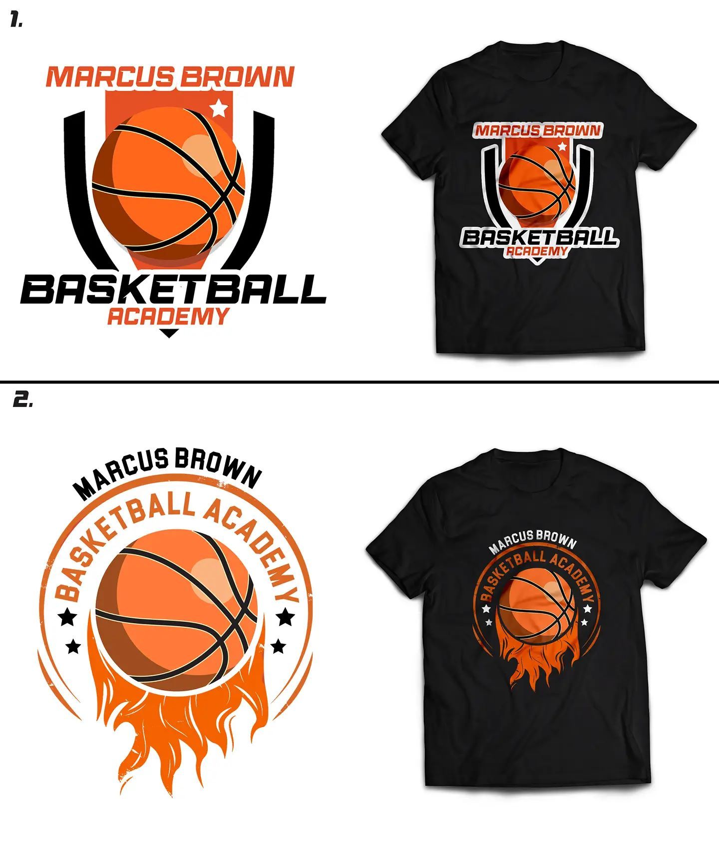
"Special thanks to @blackwell_graphics for this amazing logo. He was prompt, affordable, and very helpful."
"I've gotten so many messages and emails about this flyer. You really did your big one. Thank you again. It is well received."