01
One clear promise
A headline and opening section that match the offer people clicked for and keep attention on one message.
Landing page design should keep attention on one message, build trust quickly, and move the visitor toward one clear action.
The ad promise feels stronger than the page, the action is buried, and paid or direct traffic slips away before the offer is clear.
The visitor understands the offer, sees proof fast, and takes the next step without deciding where else to go.
A headline and opening section that match the offer people clicked for and keep attention on one message.
Sections ordered around interest, proof, objections, and the action you want next.
Reviews, proof, and useful details placed close to the point where people decide whether to continue.
A form, call, message, or booking path that fits the offer instead of asking too much too early.
The landing page stays easy to read and easy to act on where many paid clicks and direct visits happen.
The page is checked before traffic is sent so links, forms, and the action path do not let the click go to waste.
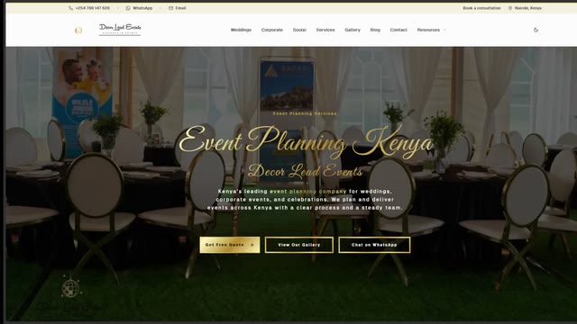
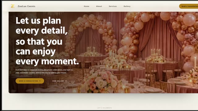
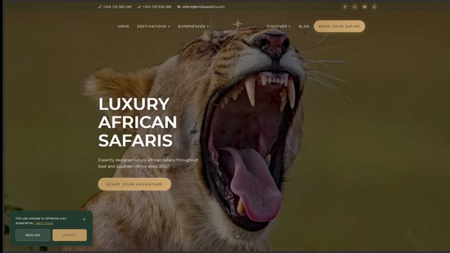
These examples are full websites, but they show the same standard a good landing page needs: a clear first screen, a believable offer, and a visible next step.
The page stays simple when the thinking is done in the right order: promise first, proof second, action third.
We decide what promise the page is making, who it is meant for, and what action matters most.
The sections, proof, and call to action are shaped around one route so the page keeps pushing toward the same outcome.
We test the form, call, or booking path and make sure the landing page is ready before you send people to it.
The right scope depends on how many offers are being promoted, how different the audiences are, and whether one page is enough.
Best when one service, event, or campaign needs one strong page with one clear next step.
Best when you need a main page plus a second route for a different audience, offer, or ad angle.
Best when you need a small group of focused pages instead of sending every campaign to the same place.
"We were mindblown by how fast Blackwell Graphics managed to deliver our website, and the entire process was seamless. 10/10 recommend."
"Having worked with other web developers who disappointed and delivered sub-par work, Blackwell Graphics were a breath of fresh air. Within 2 weeks, we had a working website, complete with SEO. Give them all your money!"
"As a professional looking to teach courses and consulting, I needed a website that fully represents me and Blackwell Graphics delivered EXACTLY that. I love my website!"
We will tell you whether one landing page is enough, whether you need variants, and what the cleanest path should be.